Inverse function as a method to generate rvs

In this post I attempt to explore some basic intuition about the inverse function as a method to generate random variables.

PDF and CDF

Suppose there is a probability density function
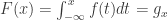
 f. One can easily calculate the cumulative density function F as:

F(x) = \int_{-\infty}^x f(t) dt = g_x

Where g_x \in [0, 1].

PDF – example

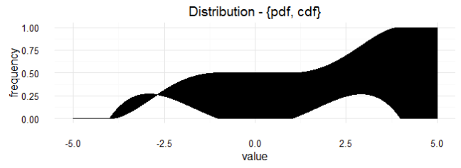
Let’s generate a probability density function f based on a polynomial equation k.  Suppose we want this pdf to describe the probability of some variable x \in r, where r is the region {[-4, -1] \cup [+1, +4]}. We define k arbitrarily as:

k = -(x^2 - 1)(x^2 - 16)

k

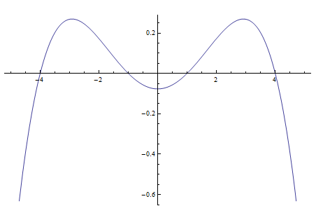
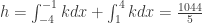
It is necessary to adjust this polynomial function to a factor of h defined by:

h = \int_{-4}^{-1} k dx + \int_{1}^{4} k dx = \frac{1044}{5}

Therefore, the probability density function f is a piecewise function defined as:

f = \begin{cases} 0 &\quad\text{if } x \in r^c \\ \frac{k}{h} &\quad\text{if } x \in r \ \end{cases}

pdf

By doing so, we can be confident that:
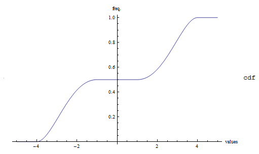
\int_{-\infty}^{\infty} f(t) dt = 1

CDF – example

Naturally, the cdf function is just an integral. But due to the fact that the pdf we are using is a pisewise function, we must divide the integrals across the region. So the cdf function F would have the following form:

F = \begin{cases} I_1 &\quad\text{if } x \leq -4 \\ I_2 &\quad\text{if } -4 < x \leq -1 \\ I_3 &\quad\text{if } -1 < x \leq 1 \\ I_4 &\quad\text{if } 1 < x \leq 4 \\ I_5 &\quad\text{if } 5 < x \ \end{cases}

We can figure the value of I_i intuitively.

I_1 = 0

I_2 = \int_{-4}^x \frac{k}{h} dx = \frac{1}{3132} (1408 - 240 x +85 x^3 - 3 x^5) 

I_3 = \int_{-4}^{-1} \frac{k}{h} dx = \frac{1}{2}

I_4 = \int_{-4}^{-1} \frac{k}{h} dx + \int_{1}^x \frac{k}{h} dx =  \frac{1}{3132} (1724- 240 x +85 x^3 - 3 x^5) 

I_5 = \int_{-4}^{-1} \frac{k}{h} dx + \int_{1}^4 \frac{k}{h} dx =  1

As a result we have:

cdf

Inverse function

The inverse function of F is expressed as F^{-1} such that:

F^{-1} (g_x) = x

In more general terms, if
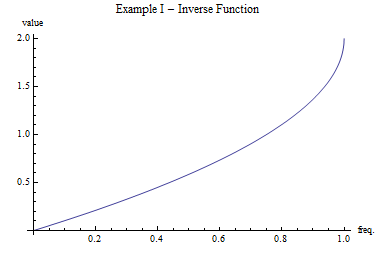
 y = f(x), the inverse function  y^{-1} = f(y)  must satisfy y^{-1}(f(x))=x.

Example I

To begin with a simple example assume we have a pdf f_2 that describes the density function of an x variable:

f_2 = \begin{cases} \frac{6-3x}{6} &\quad\text{if } 0 < x \leq 2 \\ 0 &\quad\text{if } x \leq 0 \cup 2 < x \ \end{cases}

The cdf is then:

F_2  = \begin{cases} a &\quad\text{if } x \leq 0 \\ b &\quad\text{if } 0 < x \leq 2 \\ c &\quad\text{if } 2 < x \ \end{cases}

where:

a = 0

b = a +\frac{1}{6} \int_0^{x} (6-3x) dx = \frac{1}{6}(6x - \frac{3}{2} x^2)

c = a +\frac{1}{6} \int_0^{2} (6-3x) dx = 1

ex1

The inverse function f^{-1} can only be deduced on increasing f functions. For this reason, only the b component of the piecewise cdf is going to be calculated. We can easily find the solution with x = \frac{-B \pm \sqrt{B^2 - 4 A C}}{2 A}. The general approach is to define y = f(x) and solve for x.

b^{-1} = \begin{cases} 2(1-\sqrt{1-x})  \\ 2(1+\sqrt{1-x}) \ \end{cases}

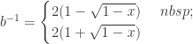
Since we expect that b^{-1} (1) = 2 and b^{-1} (0) = 0 we can rule out the second solution.


F_2^{-1} = 2(1-\sqrt{1-x}) 

ex1_inv

Example II

If we try to follow the same steps shown in Example I to calculate the inverse function of f, we would probably fail. High order polynomial function are difficult (if not impossible) to solve with analytical methods. Therefore, a numerical method is suggested for this problem.

At a first glance, switching from an analytical approach to a numeric method does not seem appealing. Nonetheless, in many cases we are better off working on a problem with a non-parametrical estimated density function (obtained from the empirical data) that with an analytical function determined by assumptions.

The first step is to have available the numeric data of the x-axis, pdf and cdf values.

# Example of inverse function
# Generating x-axis, pdf and cdf numeric values.
# last modifyed: 29/04/2016
library(ggplot2)
library(tibble)
library(tidyr)
# Mathematical function ---------------------------------------------------
pdf_example <- function(x){
flag <- F
if(x >= -4 & x <= -1) flag <- T
if(x >= 1 & x <= 4) flag <- T
if(flag)
-5 * (x^2 - 1) * (x^2 - 16) / 1044
else
0
}
# Create x-axis, pdf and cdf values --------------------------------------
n <- 5000
dataset <- data_frame( x = seq(-5, 5, 10/n ))
dataset$pdf <- sapply(X = unlist(dataset$x), FUN = pdf_example)
aux <- 0
freq_acum <- numeric()
for(i in 1:(n+1)){
freq_acum[i] <- dataset$pdf[i] + aux
aux <- dataset$pdf[i] + aux
}
dataset$cdf <- freq_acum / sum(dataset$pdf)
dataset <- gather(dataset, dens, freq, -x)
# Plot the results --------------------------------------------------------
g <- ggplot(dataset, aes(x, freq, group = dens)) + theme_minimal() +
geom_ribbon(aes(ymin = 0, ymax = freq, fill = dens), alpha =0.6, color = "black") +
xlab("value") + ylab("frequency") + scale_fill_brewer() +
ggtitle("Dataset generated - {x-axis, pdf, cdf}")
# g + geom_segment(aes(x = 0, xend = 0, y = 0, yend = 1/2), color = "dark blue", size = 0.75) +
# geom_segment(aes(x = -5, xend = 0, y = 1/2, yend = 1/2), color = "dark blue", size = 0.75)

data_gn

The cdf function F maps a variable in the x-axis to only one value in the y-axis. The inverse method F^{-1} suggest the contrary; mapping the a variable form the y-axis into the x-axis.

 So let’s suppose that we want to know the value of F^{-1} (u). The first step is to find the position of the nearest value yet smaller than u in the vector containing the data of the cdf. If the value is really close, the next step would be to use the position obtained to figure out what is the correspondent x-value. Pretty straight forward, right? There would not be problem with this if the “nearest value” is indeed significantly near to u. Due to the fact that this situation is not commonly true, an interpolation technique is recommended.

To maintain simplicity, linear interpolation is frequently used. Assume that the closest value to u in the vector containing the data of the cdf is in the i-th position. Lets call the x-axis vector x and the cdf vector z. Linear interpolation uses a simple linear model to estimate the corresponding x-value for u. In essence:

\hat{x} = \frac{x[i+1]-x[i]}{z[i+1]- z[i]} (u - z[i]) + x[i]

Since we know that z[i] < u and z[i]  is the closest value smallest value to u we also know that u < z[i+1] . By definition, cdf are increasing functions so F^{-1}(z[i]) < F^{-1}(u) < F^{-1}(z[i+1]) must also hold true. As a result F^{-1}(u) \approx \hat{x} .

inverse_func

Inverse method

If there is a random variable u drawn from a uniformly distribution U[0,1], then y is a random variable with f distribution only if y = F^{-1} (u) .

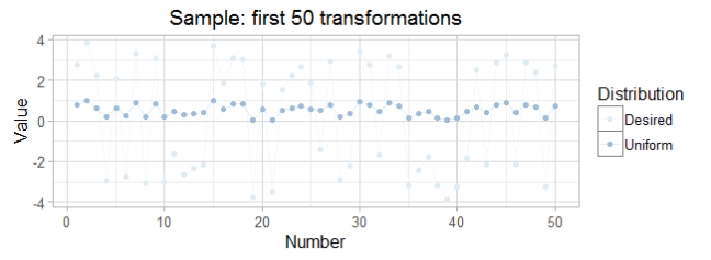
Then by using random uniformly distributed variables we can simulate any distribution. The following code shows the implementation of the numeric method to calculate the inverse function.

As a result, the inverse method allowed us to generate 5000 random variables that apparently distribute according to f .

rel_ud
A simple plot showing in the x-axis the set of uniformly distributed rv and on the y-axis the rv generated when applying the inverse method. 

first50
This plot illustrates how the transformation works, taking each uniform-rv as an input and generating the desired-rv as an otuput. 
simul_rand
The frequency histogram of the desired-rv shows that they distribute as f.


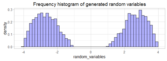
As it can be seen, the inverse method approach to generate random variables is a handy tool. The methodology allows us to apply this technique with analytical or numeric methods.

In further posts, we will explore how a density distribution can be estimated via non-parametric statistics. We will enhance monte-carlo simulations by doing so and hopefully build accurate predictive models. The inverse methodology is at the core of many high level simulations.


Alcohol and radar plots in R with ggplot2

Radar plots may be an unusual way to represent data, but under the right circumstances they can provide meaningful visualizations. In this post I will present how to create and customize some basic parameters of radar plots in R programming language.

Make sure you have the following packages:

require(ggplot2)
require(tibble)

The easiest way to generate good-looking  yet simple data visualization is through the syntax of Grammar of Graphics, cleverly implemented by Hadley Wickham in his ggplot2 package. The tibble package, created by this same author, provides an alternative to the use of dataframes. In this post we’ll give it a try.

The database used in this example can be found at The World Health Organization Global Health Observatory data.

Radar plots are generally used to represent higher dimensional data in two dimensions. It does so by plotting each variable into a separate axis resembling polar coordinates. Each axis is arranged radially from the center at an equi-angular distance from each other. Then each observation is potted according to the value presented on each category, usually joined by a line forming a polygon.

Nevertheless, this way of representing data can be misleading. For instance, the use of many axis can interfere with the visualization. Furthermore, the use of different units among axis (and unit separations) is regarded as inappropriate. A general critique of radar plots can be found here.

Taking in account the possible downsides when using radial plots, we proceed to obtain and clean the data with the following code:

# Radar Plots
# Example: consumption of pure alcohol by type of beverage
library(tibble)
# Download data -----------------------------------------------------------
# Data by country and type of beverage
url <- "http://apps.who.int/gho/athena/data/data-text.csv?target=GHO/SA_0000001398&profile=text&filter=COUNTRY:*;REGION:EUR;ALCOHOLTYPE:*&quot;
# Download and read files
file_name <- "consum_type"
download.file(url, file_name)
dataset <- read.table(file = file_name, header = TRUE, sep = ",",
stringsAsFactors = FALSE, na.strings = FALSE)
# Clean data --------------------------------------------------------------
library(tibble)
# Use data_frames to manipulate data.
# Index created to help filter relevant data
# Some columns are useless
dataset <- as_data_frame(dataset)
dataset <- dataset[, c("Country", "Beverage.Types", "Numeric")]
index <- 1:nrow(dataset)
dataset$Index <- index
# Unique countries, problem: some names are too long
# Solve problem (avoid loops when possible)
countries_unique <- unique(dataset$Country)
countries_problem <- c("Russian Federation",
"United Kingdom of Great Britain and Northern Ireland",
"The former Yugoslav republic of Macedonia",
"Republic of Moldova")
countries_solution <- c("Russia", "UK", "Macedonia", "Moldova")
countries_problem_index <- sapply(X = countries_problem,
FUN = function (x) dataset[dataset$Country == x, "Index"]$Index )
for(i in 1:ncol(countries_problem_index)){
dataset[countries_problem_index[,i], "Country"] <- countries_solution[i]
}
# Other problem: "Other" category is too large
# Solve problem (avoid loops when possible)
other_inconvinient <- dataset[dataset$Beverage.Types == "Other alcoholic beverages", "Index"]$Index
dataset[other_inconvinient, "Beverage.Types"] <- "Other"
# Add row to the data frame that contains the average consumption
beverage_unique <- unique(dataset$Beverage.Types)
beverage_average <- sapply(X = sapply(X = beverage_unique,
FUN = function(x)
dataset[dataset$Beverage.Types == x, "Numeric"]),
FUN = mean, na.rm = T)
names(beverage_average) <- beverage_unique
Numeric <- beverage_average
Beverage.Types <- beverage_unique
Country <- rep("Average Country", length(beverage_unique))
Index <- rep(as.character(nrow(dataset)+1), length(beverage_unique))
df_aux <- data_frame(Country = Country, Beverage.Types = Beverage.Types,
Numeric = Numeric, Index = Index)
dataset <- rbind(dataset, df_aux)
dataset <- dataset[order(dataset$Beverage.Types), ]
df_aux <- df_aux[order(df_aux$Beverage.Types),]
avrg_df <- df_aux
# Identify position (index) of average country
# for future use in plot
countries_unique <- unique(dataset$Country)
countries_unique <- countries_unique[order(countries_unique)]
countries_unique_index <- 1:length(countries_unique)
df_aux <- data_frame(countries = countries_unique,
index = countries_unique_index)
avr_country <- "Average Country"
avr_index <- df_aux[df_aux$countries == avr_country, "index"]$index
view raw data_cleaning.R hosted with ❤ by GitHub

Cleaning is also important in the process of data exploration. In this case we get rid of some useless variables and add some rows concerning the average data.

Now we continue with the visualization. At first we plot all the observations we have. Then we move on to select specific cases to show how can radar plots can contribute to a better understanding of the data.

# Code to generate radar plot.
# Load required data and variables
source("alcohol_data_download.R")
source("data_cleaning.R")
# functions ---------------------------------------------------------------
library(ggplot2)
library(tibble)
# function provided by Erwan Le Pennec for the radar coord.
coord_radar <- function (theta = "x", start = 0, direction = 1) {
theta <- match.arg(theta, c("x", "y"))
r <- if (theta == "x") "y" else "x"
ggproto("CordRadar", CoordPolar, theta = theta, r = r, start = start,
direction = sign(direction),
is_linear = function(coord) TRUE)
}
# Data Visualization ------------------------------------------------------
# general palette
palg <- c("#008744", "#0057e7", "#d62d20", "#ffa700",
"#1b85b8", "#5a5255", "#559e83", "#ae5a41", "#c3cb71")
# A palette to identify the average country
pal <- replicate(length(unique(dataset$Country)) ,"#555555")
pal[avr_index] <- "red"
# General radar Plot
ggplot(data = NULL, aes(x = Beverage.Types, y = Numeric) ) + theme_minimal() +
geom_polygon(data = dataset, aes(group = Country, color = Country),
fill = NA) +
geom_line( data = dataset, aes(group = Country, color = Country),
alpha = 0.5, show.legend = F) +
geom_polygon(data = avrg_df, aes(group = Country, color = Country),
fill = NA, alpha = 0.2, size = 1, show.legend = F) +
geom_line( data = avrg_df, aes(group = Country, color = Country),
color = "red", size = 1) +
ggtitle("General Consumption of Alcohol by Type of Beverage in 2010") +
theme(strip.text.x = element_text(size = rel(0.8)),
axis.text.x = element_text(size = rel(0.8)),
axis.ticks.y = element_blank(),
axis.text.y = element_blank()) +
guides(color = guide_legend(ncol = 4))+
scale_color_manual(values = pal) +
xlab("") + ylab("") +
coord_radar()
# Select some random data
n <- 5
random_index <- floor(runif(n) * (length(countries_unique) - 1)) + 1
country_random <- sapply(random_index, function(x) countries_unique[x])
random_dataset <- numeric()
for(i in country_random){
random_dataset <- rbind(random_dataset, dataset[dataset$Country == i, ])
}
random_dataset <- random_dataset[order(random_dataset$Beverage.Types), ]
# Select even more random data
n <- 12
random_index <- floor(runif(n) * (length(countries_unique) - 1)) + 1
country_random <- sapply(random_index, function(x) countries_unique[x])
randomm_dataset <- numeric()
for(i in country_random){
randomm_dataset <- rbind(randomm_dataset, dataset[dataset$Country == i, ])
}
randomm_dataset <- randomm_dataset[order(randomm_dataset$Beverage.Types), ]
# Select possible interesting countries
country_choice <- c("France", "Germany", "Russia")
selected_dataset <- numeric()
for(i in country_choice){
selected_dataset <- rbind(selected_dataset, dataset[dataset$Country == i, ])
}
selected_dataset <- selected_dataset[order(selected_dataset$Beverage.Types), ]
# randomly selected radar plot
ggplot(random_dataset, aes(x = Beverage.Types, y = Numeric) ) +
geom_polygon(aes(group = Country, color = Country),
fill = NA, show.legend = FALSE,
size = 1.1, alpha = 0.3) +
geom_line( aes(group = Country, color = Country),
size = 1.1, alpha = 0.3) +
guides(color = guide_legend(ncol = 1))+
theme_minimal() +
coord_radar() +
xlab("") + ylab("") +
ggtitle("Preference of 5 random countries: alcohol consumption in 2010") +
scale_color_manual(values = palg[1:length(country_random)]) +
theme(strip.text.x = element_text(size = rel(0.8)),
axis.text.x = element_text(size = rel(0.8)),
axis.ticks.y = element_blank(),
axis.text.y = element_blank())
# selected radar plot
ggplot(selected_dataset, aes(x = Beverage.Types, y = Numeric) ) +
geom_polygon(aes(group = Country, color = Country),
fill = NA, show.legend = FALSE,
size = 1.1, alpha = 0.5) +
geom_line( aes(group = Country, color = Country),
size = 1.1, alpha = 0.5) +
guides(color = guide_legend(ncol = 1))+
theme_minimal() +
coord_radar() +
xlab("") + ylab("") +
ggtitle("Preference of 3 countries: alcohol consumption in 2010") +
scale_color_manual(values = palg[1:length(country_choice)]) +
theme(strip.text.x = element_text(size = rel(0.8)),
axis.text.x = element_text(size = rel(0.8)),
axis.ticks.y = element_blank(),
axis.text.y = element_blank())
# random data plotted in radar plot
ggplot(data = randomm_dataset, aes(x = Beverage.Types, y = Numeric) ) + theme_light() +
geom_polygon(aes(group = Country, color = Country),
fill = NA, size = 2) +
facet_wrap(~ Country) +
theme(strip.text.x = element_text(size = rel(0.8)),
axis.text.x = element_text(size = rel(0.8)),
axis.ticks.y = element_blank(),
axis.text.y = element_blank()) +
guides(color = "none")+
xlab("") + ylab("") +
coord_radar()

As a result, the following plots are generated:

general_radial

In this plot we can see the 53 different countries in a radar form. The radar plot is not a good alternative to graph many observations. The shapes generated for each observation are indistinguishable  from each other. For this reason, it was decided to use the same color except in the average data. So at the end, this plot is merely illustrative.

rend

The previous graph made obvious the need to reduce the number of observations. In this case 5 countries were randomly selected. Now we are able to see the observations and their consumption pattern.

select

To understand the nature of this radar plots, sometimes it is useful to use data you know. For this reason we selected some countries from which their alcoholic consumption preference are obvious. As stereotypes dictate, France shows a strong preference toward wine consumption, Germany toward beer and Russia toward spirits. We can clearly see and compare the consumption patterns for each country.

ir

At a glance, the presentation of data in this format is really useful. The radar plot points toward the direction with more consumption per country. We can think of the shape of this plots as a “preference polygon” for each country. In this view the plots don’t overlap so we have a clean visualization. It provides an overall understanding of the consumption pattern of alcohol by country.


At the end, using radar plots is a tricky task. Not all data fits in the format, dimensions or number of observations that can make a radar plot interesting. As a rule of thumb, I would suggest only to use radar plots when you are confident that they can provide accurate meaning. Otherwise, the advise is to avoid them at all.


For further information:

This post was inspired by the publication From Parallel Plot to Radar Plot by Erwan Le Pennec.

Useful perspective offered by Graham Odds in A Critique of Radar Charts.